INLS 541: Information Visualization
As part of my master’s degree, I took this Information Visualization class to understand the theory behind visualization and get experience creating visualizations. I also had the chance to use a variety of visualization tools, including Tableau, Gephi, and various visualization tools available on the Internet.
Many of the visualizations I made for this class are available on my tableau profile.
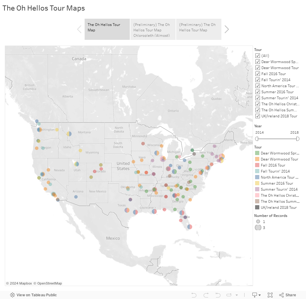
Final Visualization Project: The Oh Hellos
My absolute favorite band is The Oh Hellos, so for my final project, I wanted to visualize data pertaining to them.
My first visualization was a map showing all of the tours they have been on, and the stops they have made on those tours.
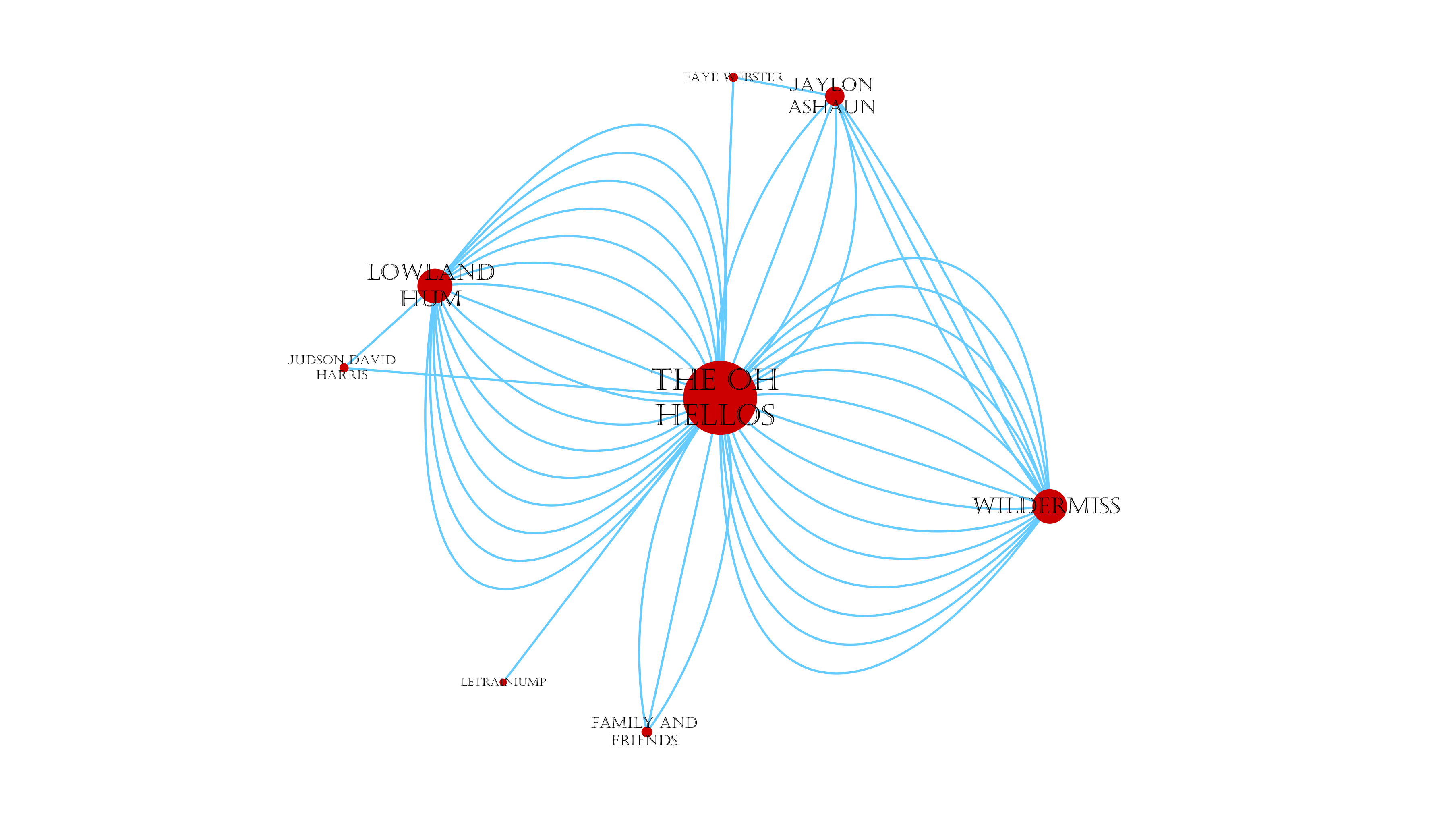
The second visualization is a network graph of the opening bands The Oh Hellos performed with during the 2018 North American Tour.
The third visualization was an animated map of their 2018 North American Tour made with Animap. (Note: As of this portfolio update, there is an issue with Google Maps connecting to Animaps which wasn’t an issue when I made the visualization last year.) Here is The Oh Hellos Animap.
The final report for the project can be viewed here.
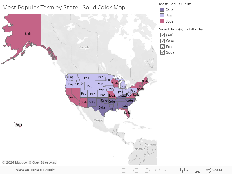
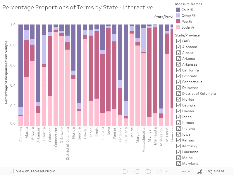
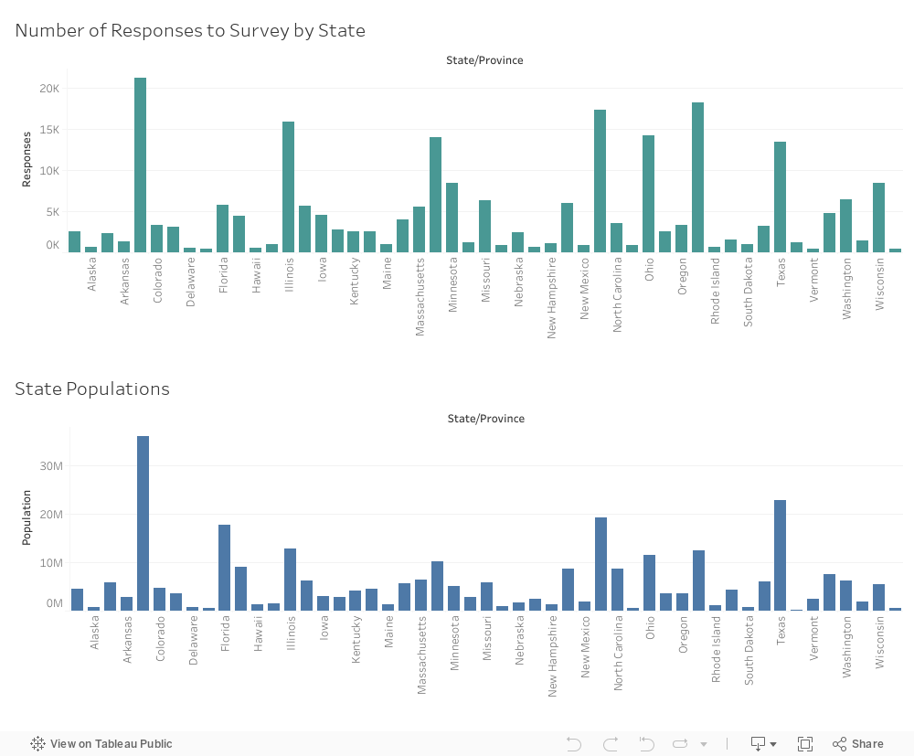
Midterm Project: Soda Pop in the USA
For my midterm project, I selected a dataset about preferences for the term to use for soft drinks, whether “soda”, “pop”, “coke”, or something else.
Here is an interactive cloropleth I made showing the percentage of popularity of each term in each state.
Here is a map that shows the most popular term in each state.
Here is an interactive bar graph that shows the proportionally popularity of each term in each state.
Here is a meta visualization I made about the data collected from the survey.
The report for the project is here. I also created alternate visualizations as part of this project to explore different visualization possibilities. These can be viewed on my tableau profile.